One of the most widespread conventions of urban design is the belief in the importance of ‘a sense of enclosure’. This term is defined by the City of Ottawa as
“when buildings physically define public spaces particularly through proportions between height and width in an area to create places that are comfortable to pedestrians.”
This article contends that the ‘sense of enclosure’ generated by following certain ratios of street height to street width is based on a valuable perception of what makes a satisfying place, but that the ratio theory is the wrong interpretation of that valuable perception. Consequently, by following the ratio theory we risk making developments that focus on concerns that may be unimportant to street users, and thereby make mistakes. In its place I’ll try to offer an interpretation of why some places that are said to ‘offer a sense of enclosure’ are satisfying that is both simpler and fits the data better, and which is constructed from two principles grounded firmly in known principles of how we perceive a place.
Conventionally, urban designers see the ratio between the height and width of a public space as one of the fundamental ideas of the profession. For example, the first specific advice given by urban design guidelines published by the Scottish Government involves height-width ratios of streets.

G2.4.3 The public realm is defined by height as well as width or, more accurately, the ratio of height to width. It is therefore recommended that the height of buildings (or mature trees where present in wider streets) is in proportion to the width of the intervening public space to achieve enclosure. The actual ratio depends on the type of street or open space being designed for. This is a fundamental urban design principle. (Emphasis mine) The height-to-width enclosure ratios shown in Table G2.1 and illustrated in Fig. G2.4 can serve as a guide.
Table G2.1 Height-to-width ratios
| MAXIMUM | MINIMUM | |
| MINOR STREETS, E.G. MEWS | 1:1.5 | 1:1 |
| TYPICAL STREETS | 1:3 | 1:1.5 |
| SQUARES | 1:6 | 1:4 |
It is rather striking that this ‘fundamental principle of urban design’ is presented without any argument or evidence for why these ratios work. The Scottish Government’s report merely presents us with these illustrations:
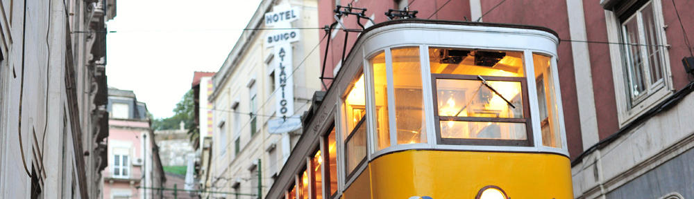
This lack of supporting argumentation is important because there are innumerable examples of streets considered charming despite the height being rather greater than the width, in defiance of the prescribed ratio. Traditionally streets in hot climates were frequently built to be much narrower than their height in order to provide shaded streets, and many pleasant streets in cooler climates also display this characteristic. Take, for example, The Shambles in York, England, which was voted Britain’s most picturesque street.
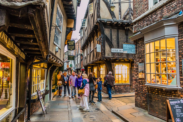
The Shambles, York. By Wayne Cappleman
This attraction is not confined to England. In China, for instance, Phoenix Town in Hunan is considered one of the very prettiest towns in the entire country, and it is also characterised by narrow, tall streets.
Even more strikingly, some urban spaces that are conventionally considered ‘great’ utterly flout the ratios. Take, for example, St. Peter’s Square in the Vatican:
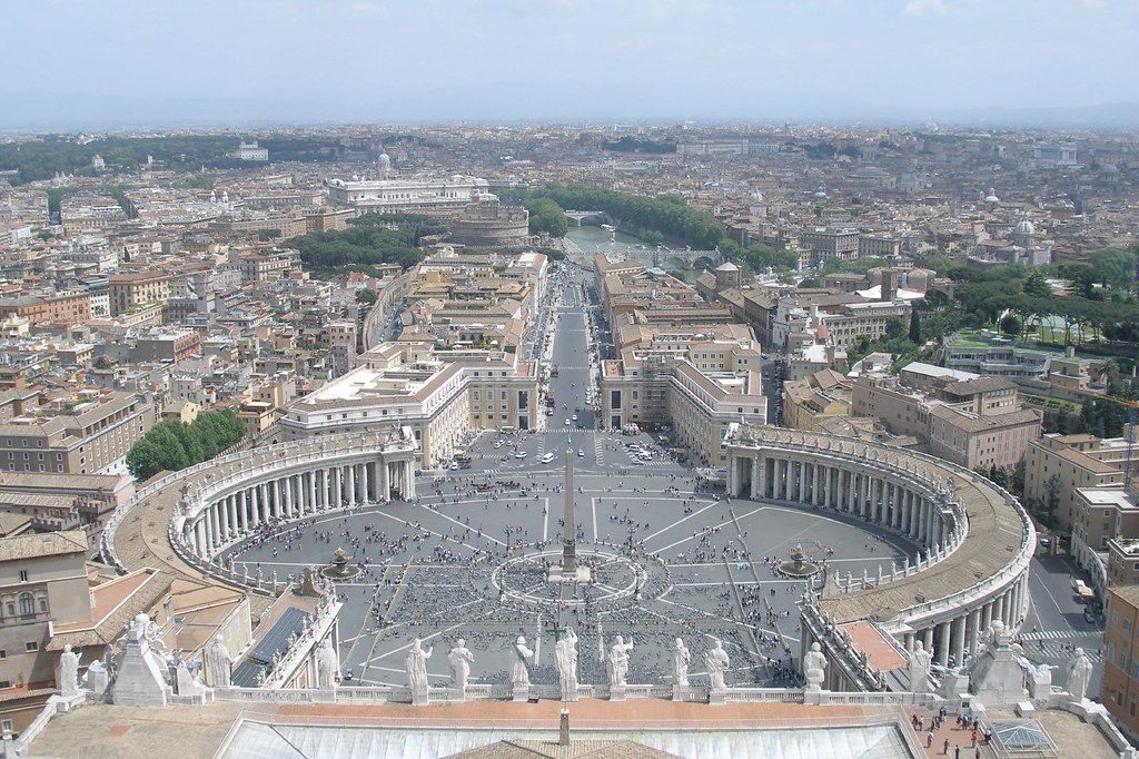
© Argenberg @ flickr.com
According to the cathedral website the enclosing colonnade structures are 21m tall, whilst the oval piazza at its widest is 240 m across. This is a height: width ratio of 1: 11.4, vastly in excess of the Scottish Government’s prescribed maximum ratio for squares.
I submit that if our theory of what makes an urban space satisfying cannot explain St. Peter’s Square then we should reconsider our theory. And if our theory of how to generate a ‘sense of enclosure’ cannot explain Bernini’s adored square whose major objective was to provide a feeling of being embraced by, in Bernini’s own words, “the motherly arms of the church” then I submit we should consider rejecting our theory completely.
However, let us be as charitable as possible to this theory and assume that it provides the standard against which to judge the dimensions of urban spaces. Let us assume that whatever falls well outside the ratios does indeed fail to provide a sense of enclosure and that therefore Bernini and the builders of The Shambles designed failed spaces. Let us assume that the theory is capable of standing up under all this weight we have placed on it.
Structural Flaws in the Ratio Theory
We do not have to look far to find serious problems with the ratios. Whilst the ratios sound impressively mathematical, naturally what they mean in practice is dependent upon what width of street is desirable: and this is what the Scottish Government guidelines admit that they cannot do.
G2.4.2 Width between buildings is a key dimension and needs to be considered in relation to function and aesthetics. Figure G2.3 shows typical widths for different types of street. The distance between frontages in residential streets typically ranges from 12 m to 18 m, although there are examples of widths less than this working well. There are no fixed rules but account should be taken of the variety of activities taking place in the street and of the scale of the buildings on either side. (Emphasis mine)
As we saw in the table, the proffered ratios give considerable leeway to building heights, allowing plenty of variance, which as a necessary by-product weakens the certainty of these ratios. Without guidelines on the desirable widths of streets the guidelines threaten to break down into meaninglessness, and can easily be pushed to absurdity since there are no limits to how large or small urban spaces may be. According to the ratio for minor streets an urban space one metre wide would give a sense of enclosure were it to be bordered by walls 67cm high. Or we might imagine some dictator building an enormous city square, 600m x 600m, in order to allow his military to parade, and fringing this square with buildings 100m high. It conforms to the ratios: does that fact alone allow us to say that the square has the basis for a satisfying place? And if not, why the stress on ratios?
Moreover, let us look again at these ratios, having reminded ourselves that in the diagram above the Scottish Government includes “squares and very wide streets” in the same category:
Table G2.1 Height-to-width ratios
| MAXIMUM | MINIMUM | |
|---|---|---|
| MINOR STREETS, E.G. MEWS | 1:1.5 | 1:1 |
| TYPICAL STREETS | 1:3 | 1:1.5 |
| SQUARES | 1:6 | 1:4 |
If it is a ratio of width to height that generates the sense of enclosure then it is very curious why this ratio should vary so very greatly depending on the type of street. A street with a 1:1 ratio apparently generates a sense of enclosure as does one of 6:1. Can we really claim as one of the fundamental principles of our profession a ratio that has a margin of tolerance of fully 600%? And this, remember, is being as charitable as possible — were we to include The Shambles and St. Peter’s Square the margin of tolerance would be simply immense.
Were the ratio theory not to conceal the astonishingly wide margin of tolerance through having different categories of streets each with their own, smaller margins of tolerance then the ratio theory would surely be obviously implausible: if a ratio can successfully be almost anything then it means almost nothing. And yet what is the justification for the division into different categories? What is the difference between a ‘typical street’ and a ‘minor street’ that enables the former to be twice as wide and still generate the same psychological effect of enclosure? At the very least we can say that the burden of proof is surely with the proponents of the ratio theory.
A Building’s Eye View: The Basic Flaw of the ‘Sense of Enclosure’ Theory
Perhaps the most fundamental flaw of the ratio theory is that, although the theory is justified with reference to the proportions that pedestrians find satisfying, the width part of the ratio is measured from the building frontage rather than the predicted paths of pedestrians. It is what pedestrians see from the places in which they are likely to be that is important, not ‘what the building sees’. (Obviously a fine view from a building’s window is also desirable, but this has precious little to do with any sense of enclosure as the viewer will already be enclosed by the walls of the room.) As pedestrians cross a public space, quite obviously, the distance to the building frontage is constantly changing yet the height of the buildings remains the same. The observed ratio of width to height is thus constantly changing. For the sake of being charitable let us assume that the bulk of pedestrian activity takes place at the edges of the space, as is very common, and that therefore the distance across (although not, of course, along) the urban space is fixed. This does not help the theory much since it fundamentally depends on which way the pedestrian is looking. Naturally, if the pedestrian is at the edge of the space then the distance to at least one building line is minimal and yet the height remains the same. The relevant height: width ratio (and thus, by hypothesis, the perceived enjoyment of the urban space) will change wildly depending on which way the pedestrian is looking. In order for the theory to have any chance of working then ratios should be established for all predicted important fields of view at all points on all predicted important pedestrian fields. This mammoth task, even if it can be accomplished, would surely lead to a ludicrously rigid set of dictates for the planning of rooflines.
However, it’s doubtful that it can be accomplished, as the human visual system is such that lines stretching into the distance converge on a single point. Provided that the height of the street’s buildings is greater than its width, then as the street’s width and height converge to a single vanishing point the apparent height of the street will diminish more dramatically than the width of the street will. (And of course vice versa).
Where the street width is not equal to its height, then, even if the ratio of height to width of a street is entirely consistent we will perceive it as constantly changing.Given this feature of how we perceive our environment, which point relative to our position should we select to calculate the ratio of height to width, and what possible justification could we use to select one visible point on a converging continuum of a line rather than another?
I suggest that the entire theory that certain width: height ratios create psychologically satisfying spaces is simply unworkable.
We should surely start looking for alternatives to the theory that so not depend on ‘objective’ qualities that are rarely experienced by the people that use the urban spaces but acknowledge that what people see is relative to their position in that space. Surely it’s time to start putting the pedestrian’s experience at the heart of any theory of what makes an urban space satisfying…
What People Are Talking About When They Talk About ‘Enclosure’
There is so much else to critique about the theory, not least the curious epicycle to the theory that allows a line of trees to function precisely as a building line would in giving a sense of enclosure, as we also see above in the Scottish Government’s diagrams. (Astonishingly enough for a theory of height:width proportions, neither the required height of the trees nor the degree of any overhang ever seems to be mentioned.)Yet as I wrote at the start there is something valuable in the perception that leads to the ‘sense of enclosure’ theory. The explanation relies on two features of our dominant sense, the human visual system.
When we survey a scene our eyes are not static but move in discontinuous jumps from one point to another, as is perfectly demonstrated by the practice of reading. These jumps the eyes make are called ‘saccadic movements’, and during these extremely high-speed movements our visual perception more-or-less shuts down in order to prevent motion blur turning our visual perception into an intolerable smear. The mind then ‘fills in the gaps’ to provide an apparently unbroken view of the world. When scanning a scene, as when scanning a page of a book, the eyes jump from point to point. Yet a scene such as an urban space is vastly more complicated than a page of a book, with many more objects. What, then, determines where the eyes jump to? In other words, what in such a scene will the eyes focus on?
The answer may be literally staring you in the face, in the shape of your computer’s webcam. You may have wondered how your camera’s autofocus seems to know exactly which of the many objects in a scene is the one you are looking at, and therefore which one to focus on. The answer that you may already have discovered is that the type of autofocus used in the vast majority of cameras — the most accurate type of focus — simply makes the assumption that you are looking at the most contrasty object in the scene. Since their outlines are blurred, out-of-focus areas tend to involve less contrast than those in-focus. The camera’s lens moves in and out until it finds the focal distance that gives the resulting image maximum contrast. That, very basically, is it. Contrast-detect autofocus achieves its 90% accuracy rate through knowing that our eyes instinctively jump from point of high contrast to point of high contrast.
This is not surprising: being able to identify movement against a still background, edges, changes in level, transitions in light etc. as early as possible is critical for how capable to deal with the environment we are. It may even make the difference between life and death: if a predator is moving towards us, for example, then if we do not see his movement early enough then we are likely to be ‘naturally selected out.’ The importance of spotting contrast is especially so given that during saccadic movements the brain is providing continuity using slightly outdated information about our environment therefore causing some vulnerability. Any form of contrast may be of use in helping us navigate the objects in our environment and avoid threats whether they be a predator or a protruding edge. Yet our visual system’s love of contrast is not only explained by our desire to avoid threats to our safety; it also greatly helps us understand other people in that it somewhat narcissistically draws our focus to what is both the most contrasty part of the typical human body and the most psychologically significant.
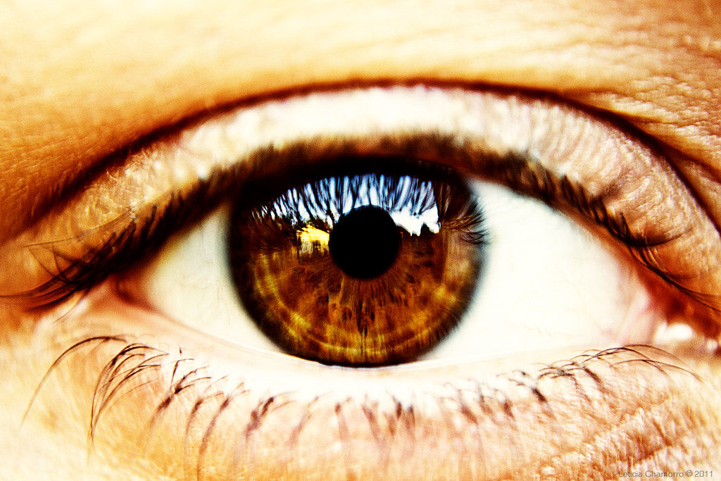
By Leticia Chamorro
Now, a quirk of most camera’s autofocus systems is that – with good reason – their algorithms are biased towards a particular type of contrast. Indeed, early autofocus mechanisms only worked when they could detect this type of contrast. This was the contrast of a horizontal with a vertical. Where a vertical line interrupts or terminates a horizontal line is roughly where our attention will tend to go.
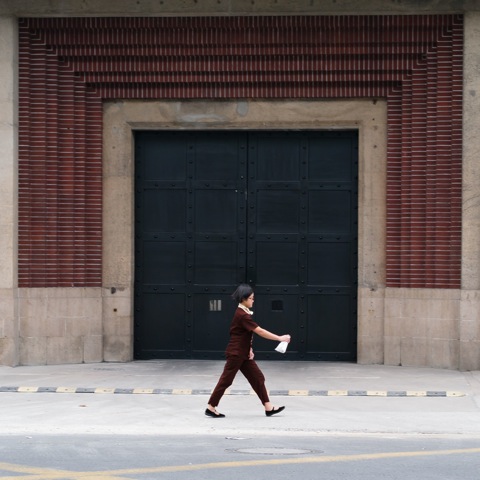
This tendency may not be surprising: we inhabit a world in which horizontal things like floors, tables, steps and shelves exist as the relatively insignificant background upon which tools, obstacles and items of interest stand, or upon which the most interesting things in our world — us — move upright. Vertical detail ‘leaps out at us’ as it offers an easy contrast for our horizontally-arranged eyes that evolved on flat African plains and are surrounded by horizontals that are so often dully convenient enablers to the main action of life.
Whatever we are focussing on, it will tend to have a significant amount of vertical detail. Yet it is important to reiterate that it is not verticality alone that is attractive but the contrast with horizontality. Our eyes are attracted to points where there is a strong vertical-horizontal contrast. However, where either the vertical or the horizontal line is so dominant that our eyes follow it to the point that we lose sight of the contrasting right-angle then we lose the contrast and thus our satisfaction.
By Christoph Kilger

Tiananmen Square. By Stefan Geens
A Theory of Contrast
I’d better set out the argument you’ve doubtless already grasped. The valuable insight that underlies the ‘sense of enclosure’ theory is the importance of verticality as a contrast to the horizontal street or square. When our eyes scan scenes they are looking for contrast; where they fail to find satisfactory contrast they get frustrated; if our vision — our overwhelmingly dominant sense — is frustrated by a place our perception of it is not likely to be positive. A lack of the vertical contrast our visual system is particularly interested in is likely to be especially frustrating given the likely predominance of horizontals in our immediate environment. Moreover, I suggest that the ratio theory is correct in asserting that a well-proportioned urban space will often be wider than it is high but that this is because we are accustomed to taking verticals as more significant than horizontals. The verticals therefore can be physically smaller than the horizontals and still appear to ‘balance’ psychologically.
However, to generate a particular ratio out of the greater significance of verticals relative to horizontals is a mistake, I contend. This is for several reasons. Firstly, the amount of verticality required for each space can vary dramatically depending upon what is required for that space. For example, walking along a street the frontages will tend to be in the peripheral vision. Whatever is in the peripheral vision will tend to be treated as less important than what is in front of us both because of the lack of sharpness (and therefore also contrast) and also because — well, there is a reason that they are in our peripheral vision rather than being selected as objects of attention. In order to compensate for this lack of importance it may benefit the psychological effect of the street if the buildings at the side are higher than buildings or other verticals that are directly in front of the pedestrians’ path. A complication to this is that the more buildings are set back from the main pedestrian path the more they recede into the peripheries of our attention and the more compensation is required.There may, then, be a case for making verticals directly in front of pedestrians smaller than those to the side, but the degree of this will be affected by the distance between the main pedestrian path and the buildings. However the case for making verticals in front of us smaller has itself to be balanced against the effects of perspective making what is distantly in front of us appear smaller than what is adjacent to us: the length of the vista is of importance. Both the precise paths through the urban space and the length of the vistas in front of those paths are important in determining the psychological effect we have been discussing, then.
What’s more, the psychological effect of various verticals can be exaggerated or diminished through various optical effects. A facade painted with contrasty colours will surely attract more attention than a grey (and therefore minimally contrasty) facade, and this will cause us to place more significance upon it than its physical size might otherwise merit.
There are other ways a facade can be attractively contrasty: through the contrast of wall and door, or the contrast of window and door, or the contrast of the stillness of the architecture with the movement of people in and out (in sum, what urban designers call an ‘active frontage’). Climate also may play a role: in climates that frequently receive strong, direct sunlight, a tree may produce a dappled pattern of dark and bright patches upon the ground; in climates that predominantly have diffuse, overcast light this will not tend to happen. None of these factors, surely, can be captured through the ratio theory but all are important in determining the psychological effect of a place. The number of contrasts to balance out a too dominant horizontality or verticality is limited only by the ingenuity of the designers. Speaking of which, here are two of the most ingenious urban spaces that I know of. Both use carefully judged verticality to offset a horizontality that could be overwhelming, and I suggest this is one reason for their greatness.
Using the Contrast Theory to Explain Two of the World’s Greatest Urban Spaces
The Spanish Steps
Let’s examine the Spanish Steps in Rome. This is a prodigiously wide staircase, and therefore ‘by default’ we would assume that the space would be dominated by the horizontality of these many, very wide steps. Assuming that we view the Spanish Steps as a success this space would be a severe challenge to the ‘contrast’ theory that has just been advanced unless we find strong evidence of attempts to minimise the dramatically horizontal emphasis of the steps and to exaggerate the verticality of the space in compensation. I’ll argue that we do indeed see evidence of this.
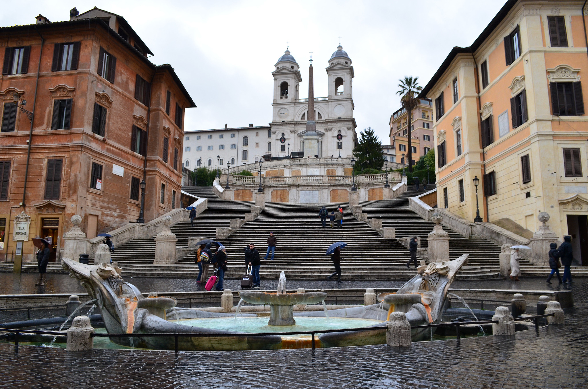
Spanish Steps, by CpaKmoi
Firstly, note how the steps towards the base of the steps are broken up by two balustrades, the start of which particularly attract the eye through their being topped by a sphere that strongly contrasts with the steps’ straight lines. These balustrades lead the eye swiftly upwards (discouraging the eye from resting on any particular horizontal step) to the wall halfway up the steps. This effect is enhanced by the narrowing of the steps. Having thus encouraged the eye to focus on this wall in the centre of the space the steps suddenly reverse their previously converging direction and slink around the wall in relative obscurity; the contrast between the stairs’ former spatial prominence and its subservience to the wall emphasise this shift from horizontality to verticality.
This wall to which our eyes have been led plays all kinds of optical tricks on us to emphasise the vertical. Firstly, the wall is coloured similarly to the church directly behind it as we view it. The similarity of colours encourages the eye to read the church and this wall as a single ‘tonal mass’ and therefore to some extent as one object. The height of the church is therefore visually exaggerated. In the same way the white stone at the centre of both levels of the wall is the same colour as the base of the obelisk, again exaggerating the height of the obelisk through similar tonal mass.
So much is done to promote verticality in the upper portion of the Steps that there could be a risk of overbalancing the composition into a too dominant verticality. To the rescue come our old friends the balustrades; just as they undermined the horizontality of the lower Steps the balustrades across the front of the two levels of the wall introduce a counter-balancing horizontality to the upper Steps. Brilliantly subtly they also help the effect of exaggerating the height of the obelisk that was just discussed. For the central slabs of white stone that appear to extend the height of the obelisk are not only at different heights but different distances from the viewer, in that each level of the wall steps back to provide a platform. The risk of this is that the line of stones will be perceived as discontinuous (whether through the shift of perspective or through people standing on top of each level) and therefore the illusion will be broken. The intervention of the balustrades that screen the base of each of the upper levels of the wall means that people cannot stand directly on top of each level and that discrepancies in how the white slabs line up are more likely to be unnoticed (since small contrasts between very similar objects are much more likely to be noticed when we have not focused on something very different in between, in comparison to which the similar objects are practically identical.)
Through these various measures the immense width of the stairs is harmoniously balanced out through a contrasting verticality. There is much more that could be said about these Steps, of course, but we’ll pass on to St. Peter’s Square in the Vatican.
St. Peter’s Square, Vatican City
By Argenberg
Upon this vast horizontal space there is an astounding array of verticals. The colonnades, arranged in rows four deep and surmounted by statues, the enormous obelisk at the centre, the fountains, the facade of the great cathedral: not only is there this wealth of verticals to counterbalance the horizontals but the square is precisely organised partly just for this purpose. For example, the extra width of the bulging area along the horizontal axis would leave too dominant an empty horizontal space were it not for the perfectly-placed fountains that through their verticality, craftsmanship and active water attract an amount of attention that is disproportionate to their size. The design also leads the eye towards the verticality of the cathedral facade: the embracing curve of the oval leads us languidly in the direction of the facade before the sudden, contrasting shift into expansive straight lines pointing directly at the facade. The contrasty lines on the floor lead the eye towards that obelisk, emphasising that vertical and therefore diminishing the psychological importance of the horizontal space.
Wonderfully subtly, go to one of two particular spots (Centro del Colonnato) just outside the central circle and look at the colonnades – you’ll see that the four rows of columns are so lined up to converge on this central point that you can only see one row: at every other point in the square the contrast of the white columns and the shadowed space beside is undermined by the partial visibility of rows of shadowed columns behind. The partial visibility of the rear columns effectively make the columns seem much wider (and thus more horizontal) and ill-defined (and thus less contrasty) than each really is.
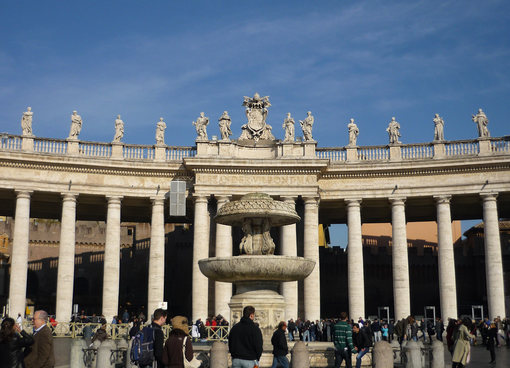
By Twyxx, from Centro del Colonnato
Yet at pretty much the point at which you are both furthest from the colonnades and with your back turned to the obelisk — i.e. where the colonnades look smallest, the horizontal space looks most enormous and you can no longer rely on the sight of the obelisk to help correct the unbalanced dominance of the horizontal over the vertical — the columns suddenly stand out most against the background. For the columns are perfectly in line so that the rear ones are invisible; rather than seeing four overlapping pillars we see just one. The strength of this contrast is magnified by the contrast between this and every other view of the columns as the viewer walked across the square. Right when strong vertical contrast is most needed the design delivers.
Key to both the Spanish Steps and Saint Peter’s Square, then, is the attempt to balance a horizontality that threatens to be overwhelming through a judicious use of verticals. Often these verticals are near the centre of the space, and this is worth stressing since the ratio theory puts such vast importance on the perimeter of an urban space and so little on its middle. To repeat, St. Peter’s Square is 240m wide. Were a street to have a similar width then (using the standard British motorway lane width and providing 5m of pavement on each side) it could accommodate sixty-three lanes of traffic. Could we possibly imagine standing on the edge of sixty-three lanes of traffic and thinking ‘what a satisfying urban space’, irrespective of how tall the walls are? If not then we should not ignore the middle of spaces. In successful square after successful square we find vertical monuments, vertical statues, vertical fountains set amid a lot of empty horizontal space. Very frequently these monuments of various types have been the produce of long deliberation and massive fundraising drives amongst an impoverished population to employ the very best artists the towns could possibly hire. Are we to somehow ignore this because we cannot see how an obelisk or a staue of a local worthy contributes to a ‘sense of enclosure’?
I submit that the contrast theory explains the success of urban spaces such as St. Peter’s Square much better than the ‘sense of enclosure’ ratio theory, and invite you to make arguments to the contrary.
There is much more that could be said; however, I hope to have made a case that the ratio theory is unworkable, that the motivation for the theory can better be explained through an analysis of contrast, and that this theory can be used to analyse some of the most remarkable urban spaces we have.